Wednesday, August 25, 2010

New (Sept) work


Helloooooooo redesign! The Sept 2010 issue of Entrepreneur magazine ushers in a new look and feel, complimenting the overall package we have worked so hard to create. The result? A highly engaging, energetic experience. Photo-driven layouts that coincide with fun, inventive, useful articles. It has, if I may, PERSONALITY.

HauteLook's Adam Berhardt is on the subscriber cover looking mighty fine. Four young millionaires (Foodzie, ModCloth included) lend some youth and freshness. Speaking of youth, we have an 8-year old entrepreneur. They're growing 'em young these days.

All in all, I am very proud of all the art/edit team here has accomplished. Kudos for all the hard work, and may each issue be better than the last.

Sunday, August 1, 2010

A hipstamatic roadtrip


The trusty hipstamatic was on standby for a mini-roadtrip to Vegas, capturing quintessential Vegasisms.

Friday, July 23, 2010

New (August) work


August is the last of the 2008 redesign look and feel of Entrepreneur. Starting with the Sept issue, we are rolling out a fresh, updated look. The intent of this mini-redesign was to tweak the design (mostly of columns and departments) to really work in sync with the engaging content we have spent the past two years developing. The new look is clean, crisp, and allows our amazing photography to breathe a bit. Stay tuned for samples!

Wednesday, June 23, 2010

New (July) work


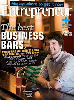
One of my favorite features of the year...the Best Business Bars in America. Incredibly fun edit (including a running thread of business-drinking rules by acclaimed Esquire magazine writer Ross McCammon), and a packed to the gills layout.

Monday, June 21, 2010

Hipstamatic!


Playing around with my fun new app in Maine.

Friday, June 4, 2010

Redesign update

Honestly, not much to update. It's slow going. One of the skills I count on is my ability to work under pretty intense pressure. I can pull off some amazing feats, though admittedly not all of them brilliant. And it's looking like, despite my best efforts, that's going to be the case here as well.

Two redesigns in the works, one semi-complete. The other just little ideas floating around in my head.

Two weeks til we hit the ground running.

Oy.

From the depths of the "never-see-the-light-of-day" vault.


Some layouts I personally dig that got axed along the way. Some are rough (placeholder copy, etc), others polished with a bit more shine.

Monday, May 24, 2010

A redesign process, step 1

I am in the process of redesigning an as-of-yet unnamed project (the samples are posted below). The elements are slowly coming together (and I have to say, I'm pretty happy to be able to take my time on this one, it's a big improvement from the speed-of-light redesigns I've pulled off before). Colors are up in the air still, the entire font set is debatable, but you know what? I love having time to explore.

The look: modern, fun, lighthearted, engaging. Perfect font choice? Aki Lines (see numbered font in below post). It's just a small piece of the puzzle, and will be for only a few elements here and there, but I am happy to have Aki on board. In doing some digging (ok, more of a scraping the surface) I saw that Aki was designed in the 1970s. In all its retro glory, it will be mine.

Thursday, May 20, 2010

Sneak a peek!


Got a secret project going on right now, and wanted to show a few tidbits. Completely out of context, here are a few screen shots, a la dribbble. Man, do I want an invite for that site. Sigh!

Wednesday, March 17, 2010

Monday, February 22, 2010

New March work

New work


Wow, this March issue really flew by--hard to believe it's already hit the shelves. Thanks to a reminder from David Johnson, famed photographer who shot these beauteous new spreads, I hereby present March samples:

Tuesday, February 9, 2010

Business book design...

...needs a revamp. Wow, what an uninspired category. Obviously there are some exceptions, but the majority of books seem to be designed as an afterthought. Such an important piece of a publication's marketing wasted.

Now, we designers know there are always concessions to the scrubbing machine, but these cover designs are not so much design as...well, giving up.

For samples, take a gander at amazon under business book bestsellers.

Branching out

New year, new projects. Today I got a book cover assignment. It fell into my lap at a crazy busy time (three magazine issues simultaneously), but I am excited to design something new despite my schedule. It's my first book cover--well, first real, live, not-student-work cover--of my career, so of course I'm feeling a little pressure. In preparation, tonight I'm sitting down to research and come up with a few ideas. I'm fairly sure it's going to be typographic (tradition dictates, but I'm going to attempt to mix it up), and since it's a business book, it'll have to be fairly straightforward.

My challenge is keeping it fun and interesting while reinventing--yet staying true to--a 5-year-old, stale brand.

Let's look at some samples. I chose these covers in the first two minutes of searching. My requirements were simple: that the cover jump out at me. Now, granted, I am looking online without any of the distractions of the newsstand. But, I think they can all be called straightforward and simple, and not hugely surprising (a great contrast color), each cover uses red.

Off for more research. I'll check back in with my progress later! Here's a look at the covers I pulled (above).

Monday, January 25, 2010